# Landing page
## Availability
\[SINCE Orbeon Forms 2022.1]
## Introduction
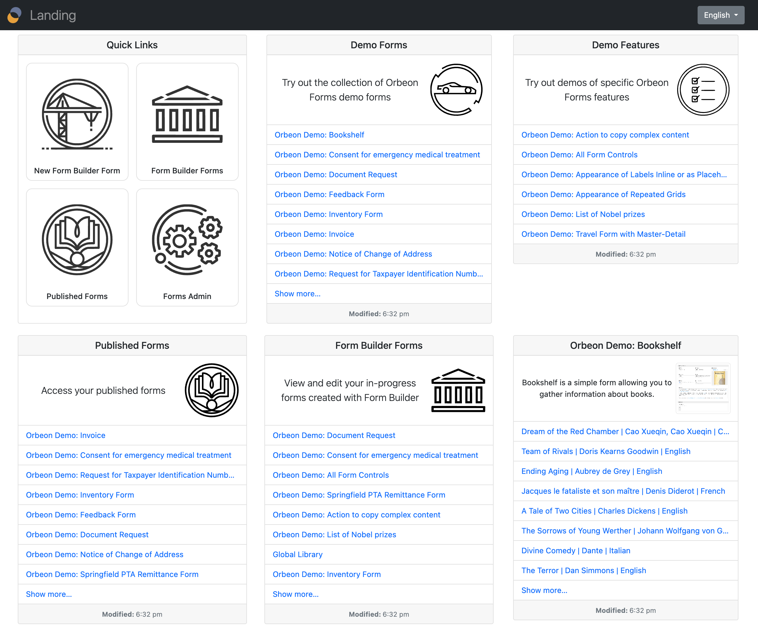
The Landing page is organized in cards which provides quick access to:
* Quick links, including Form Builder and the Administration page
* Your published forms
* Your in-progress Form Builder forms
* Demo forms

Some cards directly list content, including the list of published forms and the list of in-progress Form Builder forms.
You can configure whether you want to have a particular card on the Landing page. For example, you can hide the demo forms for production deployment.
All Form Runner and Form Builder navigation bars now provide a direct link to the Landing page. This can be disabled if not desired.

## Configuration properties
The following property control which cards are shown on the Landing page:
```xml
```
[\[SINCE Orbeon Forms 2024.1\]](https://doc.orbeon.com/release-notes/orbeon-forms-2024.1)
You can add cards showing the latest data for specific forms. You do so by adding a token of the form `$app/$form/$version`, where:
* `$app` is the application name
* `$form` is the form name
* `$version` is the form version
For example, to show the latest data for the form `acme/sales/1`, you would use:
```xml
```
[\[SINCE Orbeon Forms 2024.1.1\]](https://doc.orbeon.com/release-notes/orbeon-forms-2024.1.1)
The following property controls the number of rows available on cards shown on the Landing page:
```xml
```
[\[SINCE Orbeon Forms 2024.1.3\]](https://doc.orbeon.com/release-notes/orbeon-forms-2024.1.3)
The `oxf.fr.landing.cards` property can now be in JSON format and specify more options for cards. Here is an example:
```json
[
{
"card-type": "quick-links"
},
{
"card-type": "published-forms",
"title": "landing.titles.demo-forms",
"description": "landing.descriptions.demo-forms",
"thumbnail": "/apps/fr/style/images/orbeon/sports-car.svg",
"app": "orbeon"
},
{
"card-type": "published-forms",
"title": "landing.titles.demo-features",
"description": "landing.descriptions.demo-features",
"thumbnail": "/apps/fr/style/images/orbeon/checkboxes.svg",
"app": "orbeon-features"
},
{
"card-type": "published-forms",
"title": "landing.titles.published-forms",
"description": "landing.descriptions.published-forms",
"thumbnail": "/apps/fr/style/images/orbeon/book.svg"
},
{
"card-type": "form-data",
"app": "orbeon",
"form": "builder",
"version": 1
} ,
{
"card-type": "form-data",
"app": "orbeon",
"form": "bookshelf",
"version": 1
}
]
```
The following card types are available:
* `card-type` (string, required): type of card; possible values are:
* `quick-links`: quick links card
* `published-forms`: published forms card
* `form-data`: form data card
For each card type, the following options are available:
* `quick-links` card options: none
* `published-forms` card options:
* `title` (required): title of the card
* `description` (required): description of the card
* `thumbnail` (required): URL of the thumbnail image for the card
* `app` (string, optional): application name to filter forms; if not specified, all applications are shown
* `form-data` card options:
* `app` (string, required): application name
* `form` (string, required): form name
* `version` (integer, required): form version
For the `form-data` cards, the title and description are taken from the form definition.
Titles and descriptions shown above use Form Runner resources. You can also specify them directly as strings, by language code:
```json
{
"title": {
"en": "My Title",
"fr": "Mon Titre",
"_": "My Title [TODO: localize]"
},
"description": {
"en": "My Description",
"fr": "Ma Description",
"_": "My Description [TODO: localize]"
}
}
```
The special `"_"` language code is used as a fallback when the user's language is not found.
[\[SINCE Orbeon Forms 2025.1\]](https://doc.orbeon.com/release-notes/orbeon-forms-2025.1)
## See also
* [Published Forms page](https://doc.orbeon.com/form-runner/form-runner-pages/published-forms-page)
* [Forms Admin page](https://doc.orbeon.com/form-runner/form-runner-pages/forms-admin-page)
* [Summary page](https://doc.orbeon.com/form-runner/form-runner-pages/summary-page)
* [Summary page configuration properties](https://doc.orbeon.com/configuration/properties/form-runner/form-runner-summary-page)
* [Summary page buttons and processes](https://doc.orbeon.com/form-runner/advanced/buttons-and-processes/summary-page-buttons-and-processes)
* [Form Builder Summary page](https://doc.orbeon.com/form-builder/summary-page)
* [Access control for deployed forms](https://doc.orbeon.com/form-runner/access-control/deployed-forms)
* [Form Builder permissions](https://doc.orbeon.com/access-control/editing-forms#form-builder-permissions)
* [Versioning](https://doc.orbeon.com/form-runner/features/versioning)
* [Control Settings dialog](https://doc.orbeon.com/form-builder/form-editor/control-settings)
* Blog post: [Summary page versioning support](https://blog.orbeon.com/2019/05/summary-page-versioning-support.html)